Shop signs and printing
Choose sign text size at the intended reading distance

A sign that looks readable on a monitor may fail at an entrance. Choose text size by testing a print where people will actually read it.
On this page
Define the viewing position
A headline seen from a walkway and a note read at arm's length serve different roles. Decide where the reader stands and measure the available display area.
Print the essential text first
Test the headline and important numbers before finishing the decoration. Adobe discusses size-based emphasis, but an appropriate physical size still depends on the setting.
Reduce competing copy
Before shrinking everything, move secondary material to another surface where practical. Keep decision-critical prices and conditions; remove repeated greetings or decorative wording first.
Vary the test conditions
Ask a reader unfamiliar with the draft to inspect it. Check lighting, glare, crowd obstruction, and easily confused numbers. Record the paper size and print scale that produced the tested result.
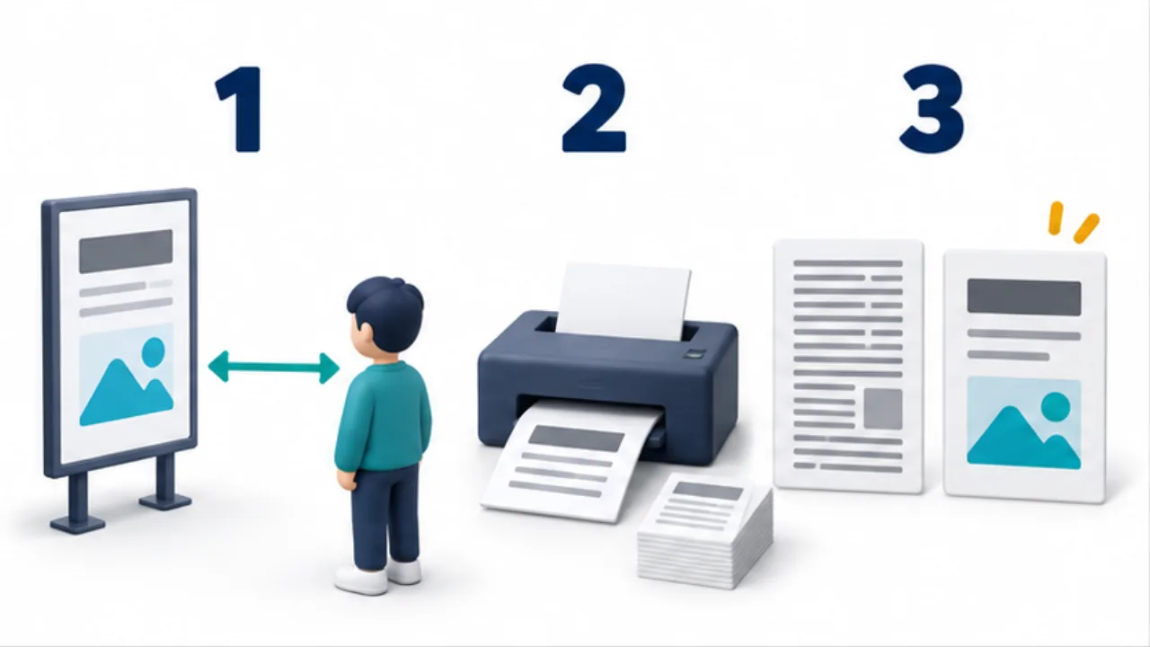
Select the image to enlarge.
- Identify the reader’s position and available sign size.
- Test the main heading and numbers on paper.
- If needed, reduce repetition or separate details while retaining essential conditions.
One sign can have two reading distances
A headline meant to be noticed from farther away and an explanation read up close need not share the same size. Decide what the distant reader should learn first, then organize the detail as the next question that reader would ask.
Do not hide essential conditions in tiny supporting copy. A notice limited to certain dates or products needs the qualification to remain connected to its main message. Size differences should establish reading order while keeping the decision accurate.
Example: revise opening hours at an entrance
Suppose visitors should read the hours before reaching the door. Print a first draft containing only the heading, operating times, and necessary conditions such as the closed day.
From the intended approach position, ask a person unfamiliar with the draft to read the times aloud. This avoids relying on the designer's memory of the text.
If the result is unclear, remove repeated greetings or explanations and allocate more space to the necessary lines. If that still fails, compare a larger sheet, separate close-reading detail, or a different placement. Making the text small enough to fit does not satisfy the purpose of reading it from the entrance approach.
Identify the type of reading problem
| Observation | What to reconsider |
|---|---|
| Text is not noticed | Placement, surrounding notices, and priority |
| Text is visible but unreadable | Size, weight, and background |
| Numbers are misread | Typeface, spacing, and time separators |
| Words are read but the meaning is wrong | Wording and condition placement |
Identify the problem before repeatedly changing the point size. Lighting or reflection can also affect the result, so carry out the final review at the installed location.
For additional copies, retain the tested paper size and scale. If adapting the design to another format, test it again at the new reading distance. A stored font-size value describes the design setting, not every situation in which the sign may later be used.