Shop signs and printing
Explain where a queue starts and how to wait
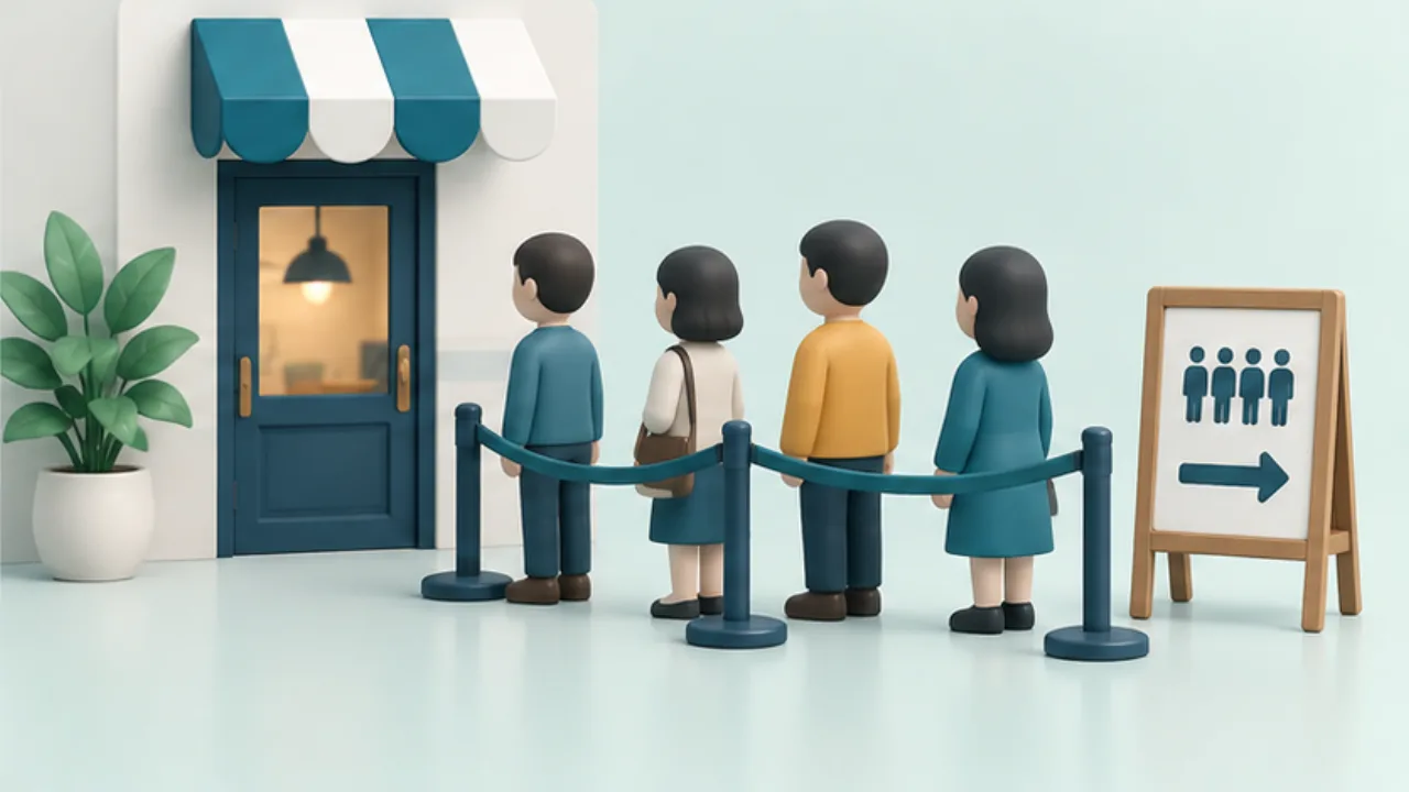
A queue sign needs to explain more than “Line up here.” Match its wording to the actual waiting process and physical route.
On this page
Distinguish service from the back of the line
The service point and the queue's end need different signs. Verify arrows from their installed positions, especially when a movable sign may face another direction.
State the first action
For a ticket system, an original sequence is: “Take a number at reception. Wait in [area]. Go to [counter] when called.” Do not use that wording for a simple first-come line without tickets.
Preserve passage
Check entrances and routes to other areas. Use text or shapes alongside floor colors. W3C's web guidance on avoiding color-only communication is a useful design principle here, though it is not a printed-sign specification.
Review during actual use
Check whether people obscure the notice and whether visitors using wheelchairs or strollers can identify a waiting place. Agree who changes the signs when the queue layout changes.
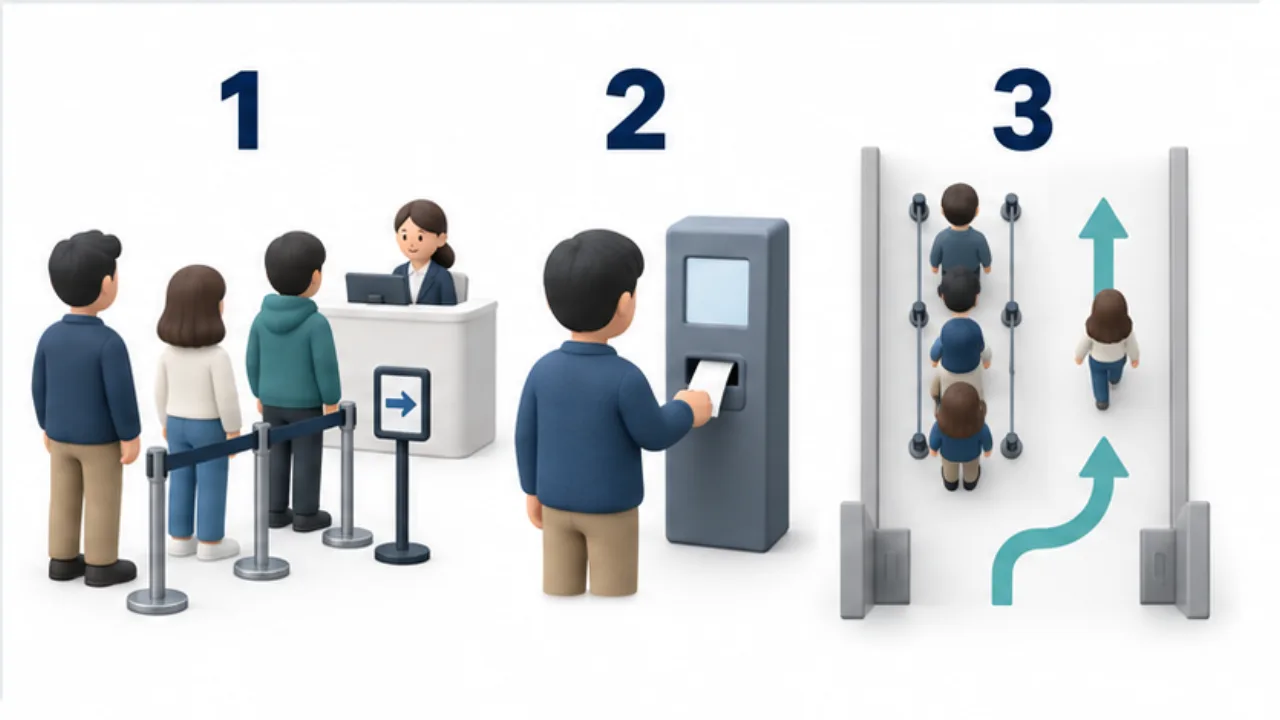
Select the image to enlarge.
- Distinguish the service point from the end-of-line notice.
- Explain any required step before queuing, such as taking a ticket.
- Keep passage to entrances and other areas clear.
Identify the decision before joining
A first-time visitor may see a line without knowing whether to join immediately or register first. Order the instructions around the customer's first decision, not around the sequence staff already know.
If a ticket is required, do not put that information only at the far end of the queue. Where ordering and collection lines sit together, name both purposes. “End of line” can remain ambiguous without saying which line it belongs to.
Example: take a number before waiting elsewhere
Imagine a reception point that issues numbers and a separate waiting area. At the entrance, state the first action: take a number at reception. Beyond reception, explain where to wait until called.
This places the instruction where the decision occurs instead of making one distant notice explain the entire process. Use the same counter name when directing a called customer onward.
As the waiting area fills, check whether people obscure the entrance instruction. If the waiting location changes, update the staff explanation and arrows together with the sign's position.
Read the route with people present
| Viewing point | Review question |
|---|---|
| First arrival at the entrance | Is the first action clear? |
| Joining position | Is this the end of the correct queue? |
| Waiting area | Is the destination after being called clear? |
| Through route | Can passersby distinguish their path from the waiting space? |
Use floor marks or color as supporting cues and express the action in words too. An arrow's meaning depends on the installed position and the viewer's direction, so do not evaluate it only while holding the printout.
After installation, record where staff repeatedly provide extra directions. Those questions identify wording or placement worth revising. The review concerns reducing uncertainty about the process; it does not establish a guaranteed change in queue length or waiting time.