Shop signs and printing
Build a shop sign that works in monochrome
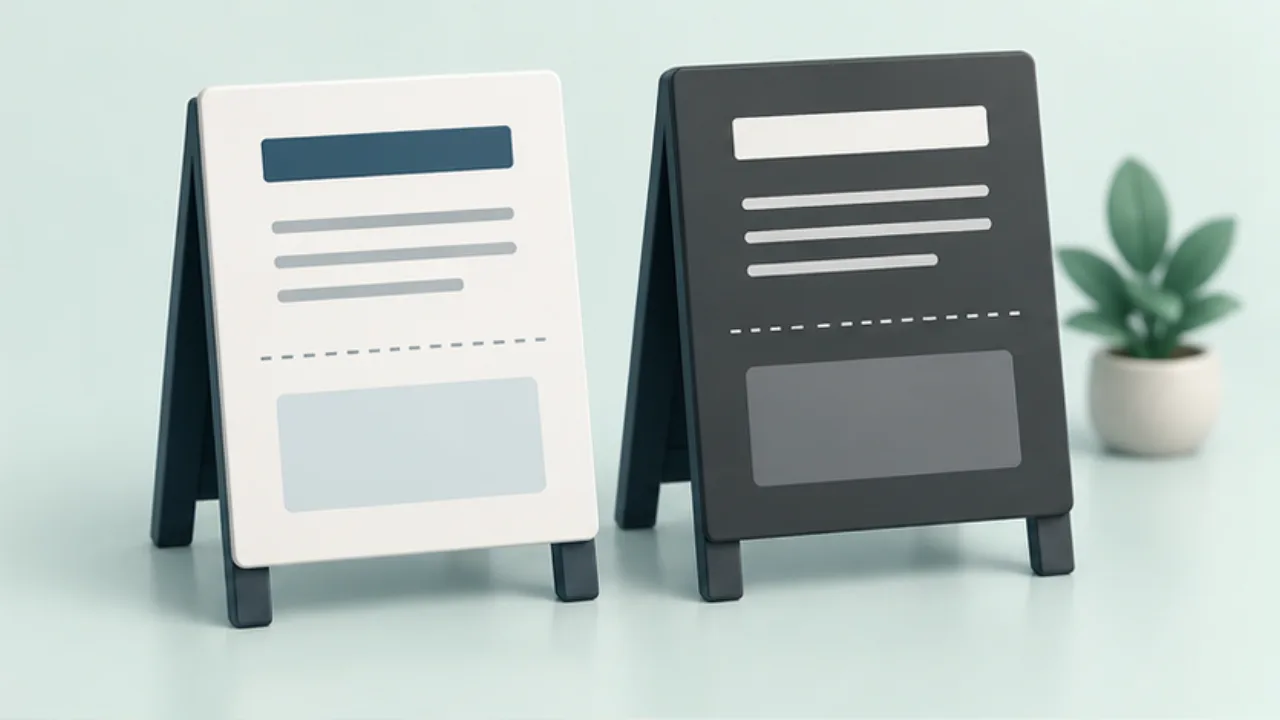
Colors can collapse into similar shades of gray. Design distinctions with words and layout before sending a color sign to a monochrome printer.
On this page
Label each distinction
Give separate sections explicit headings. Write states such as “Reserved” or “Walk-ins” rather than relying on background colors. This applies the general principle behind W3C's color guidance to a paper layout.
Limit heavy backgrounds
Compare a plain black-on-white version with a reversed headline. Inspect whether small white letters fill in during printing.
Give photographs a clear role
Choose images whose shape or use remains understandable without color. If color is essential to choosing a product, add its name in text.
Test the reproduction path
If staff will photocopy the sign, inspect a photocopy too. Check fine lines, notes, and QR codes. When details disappear, revise their structure rather than only turning up print density.
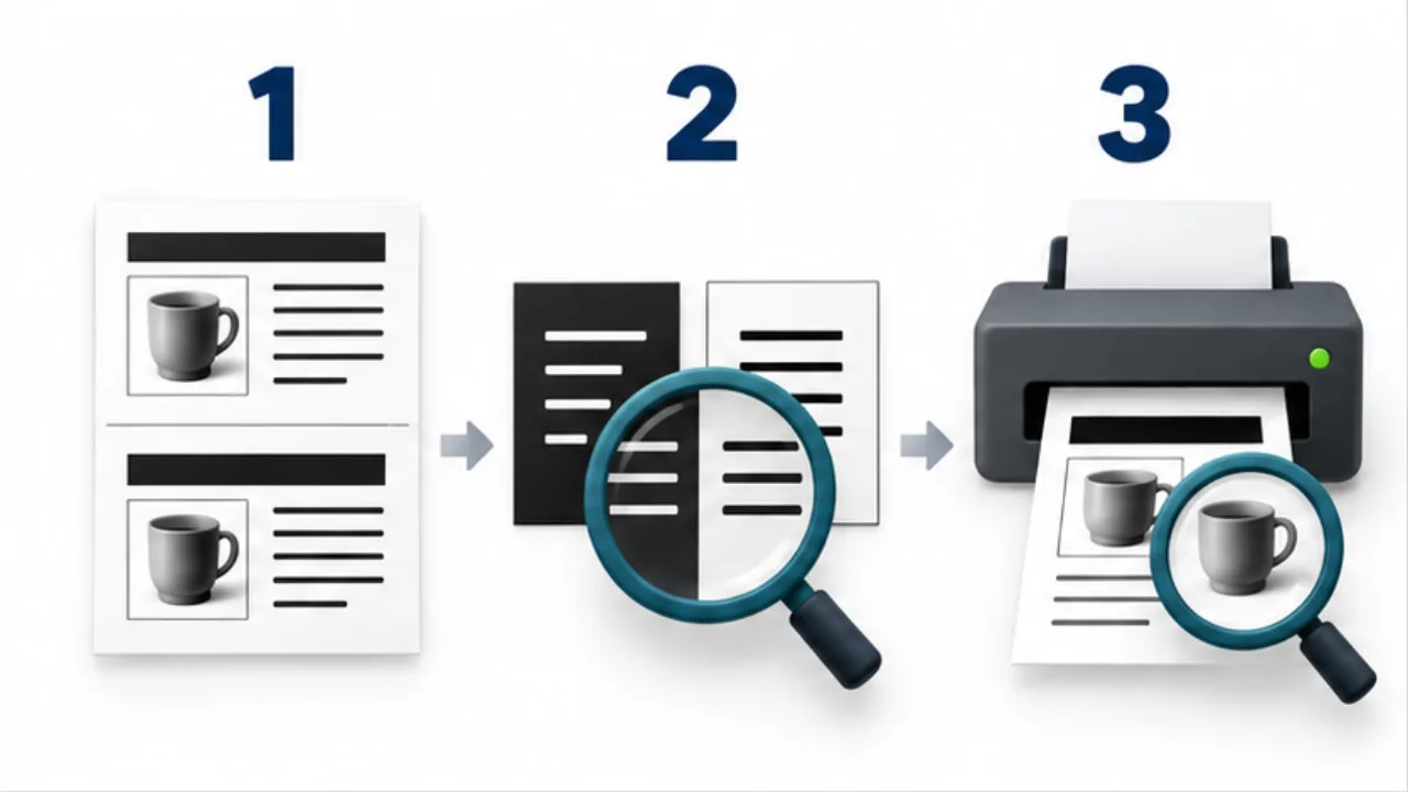
Select the image to enlarge.
- Pair color-based groupings with headings or shape differences.
- Check dense backgrounds and thin reversed text in print.
- Inspect the real print for readable information and useful photographs.
Build reading order without relying on color
In monochrome, use heading size, weight, spacing, and borders to organize the message. Making every line bold removes useful differences. Identify the main announcement and the conditions that follow it.
Ask what each original color was doing, then replace that role explicitly. For status distinctions, words such as “Reserved” and “Open for registration” remain meaningful when shades change. Associate arrows and diagrams with text so they are not mistaken for decoration.
Example: adapt a color event notice
Imagine a draft with a red heading, blue application instructions, and a pale panel for conditions. Print it in monochrome and identify which distinctions disappear.
If the application instructions merge into the body, add a clear section heading and space. If the conditions panel disappears, use a border and label rather than relying only on a darker fill.
For a necessary photograph, choose one that still explains the venue or product shape without color. If it shows color variants, label each color in text. Then review the date, participation conditions, and QR code in order. The action-critical information should survive the adaptation.
Include copying in the review
| Stage | What to inspect |
|---|---|
| Source | Headings and states remain understandable without color |
| First print | Fine lines and reversed text remain usable |
| Photocopy | Pale information and detail have not disappeared |
| Installed sign | Required numbers are readable at the intended distance |
If staff regularly reproduce the notice, consider providing the approved digital source for new output rather than repeatedly copying a previous copy.
Retain a proof suited to the paper and equipment used so later prints have a comparison reference. Do not treat increased print density as the only remedy for missing distinctions. Clear labels, text structure, and deliberate spacing can preserve the message more directly.
The aim is a sign whose meaning survives the shop's actual production process, including any photocopying that occurs after the first designer-reviewed print.